Icosian Reflections

…a tendency to systematize and a keen sense

that we live in a broken world.

IN  WHICH Ross Rheingans-Yoo—a sometime quantitative trader, economist, expat, EA, artist, educator, and game developer—writes on topics of int­erest.

On the AAU Survey and the Crimson

I've got an op-ed in the Harvard Crimson today, expressing my concern that an important narrative is missing from the discussions of the AAU sexual assault climate survey. Excerpt:

When male survivors are invisible, they face stigma against seeking help. Though male and female survivors of sexual assault seek out institutional resources at roughly the same (low) rates, male survivors are 60 percent more likely than female survivors to speak to no one—not even a friend—after an assault. (31.2% versus 19.3% for assault by force; 38.1% versus 23.3% for assault by incapacitation.) And so male students make up more than a quarter of silent survivors, in large part because we so rarely acknowledge that they exist at all. (...)

Those numbers, by the way, come from tables 3.1a,c and 3.5a,b in the full report. Below, I've got few thoughts that didn't make it into the published version.

disclosure: I am, at least on paper, still a Crimson editor on the Design Board and Data Science Team. My published-articles count is now...one.


(1)

I've heard (and more or less believed) "one in three women" for longer than I can remember. And so the fact that the report basically confirms that number doesn't mean all that much to me. I suppose if you doubted that number but believe it now, then the report is big news, but otherwise, this isn't a new crisis because we already knew that it was a crisis, and hopefully, were already acting accordingly. Waiting until the evidence is undeniable before updating

READ MORE

Sex: Statistics and Student Opinions

This week, MIT released Survey Results: 2014 Community Attitudes on Sexual Assault, making them one of the first schools to release such broad survey data on sex crimes. These are the results of a survey emailed to MIT undergraduate and graduate students last April, which had a response rate of 35% from 10,831--3,844 total responses.

I wish to be clear: Without good reason to believe otherwise, I'm taking these statistics as probably representative of MIT's peer institutions as well, and in no case do I mean to critique MIT specifically by citing them. If anything, the school deserves praise for its dedication to transparency by publishing such detailed statistics.

Now, MIT is clear that the document they've published should be taken as initial, not final, results:

"This document is a summary of the most pertinent results corresponding to questions asked in the survey; it is intended to be an initial summary of survey results. Throughout the upcoming academic year we will work with the community to use the
survey data to answer additional important questions. New findings will be posted to web.mit.edu/surveys/health/, where the full text of the survey questions and other related information can also be found."

They are also upfront about acknowledging the inevitability of response bias:

"Response bias is expected in virtually any voluntary survey, particularly one focused on a narrow topic. While we invited all enrolled graduate and undergraduate students to take this survey, and more than one-third responded, it is not possible to know if students self-selected in or out of the survey in a way that would bias our results. For example, it is difficult

READ MORE

Bad Graphs

In the wake of the announcement of Harvard's first wave of '18 admits, the Harvard Crimson is reports on the high-school demographics of Harvard's student body. The investigative article sheds some sunlight on just how much inequity exists between privileged "Harvard feeder schools" and the rest of the downtrodden teenaged proletariat.

Graph featured on The Crimson

That is, surprisingly little.

Oh, sure; the graph is concave. That means that...some schools sent more kids than other schools. Huh. How many more? Well, just reading the graph, something like 45% of Harvard students were the only admit from their school, and something like 78% are one of three or fewer kids from their high school. By contrast, the top schools send...15. A whopping five times more. Um. Right.

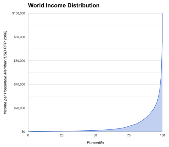
For contrast, this is what real inequity looks like:

Things on the right are people with obscene amounts of money. For reference, poverty-line America is ~95%tile.

(Yes, they're graphing different things, but the mathematical point remains valid.)

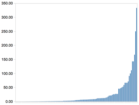
Or, on a brighter note, the cost-effectiveness of different world health interventions:

Things are the right are awesome ideas we can be doing even more of.

So yes, some high schools send ~15 students to Harvard every year. Some send one every ~4 years. The real problem, of course, is the high percentage of schools that never have sent a student to the Ivy Leagues, and never will. Or, for that matter, the gigantic percentage of people in this world who had the misfortune to be born in a place where education through high school wasn't mandatory, easy, or even available. But that, of course, doesn't show up on the Crimson's graph, because that wasn't part of

READ MORE
1 / 1